T-Mobile DIGITS
The following is a case study for a company I worked for. I have redacted all business information, data, budget, persona, and anything under NDA.
User Flows & wireframes
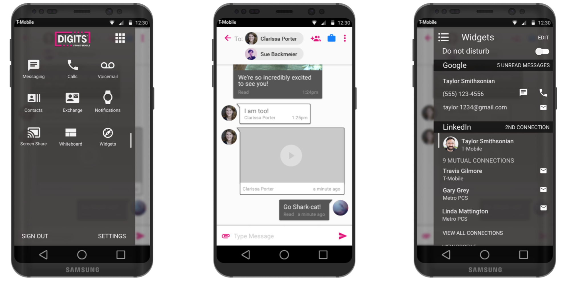
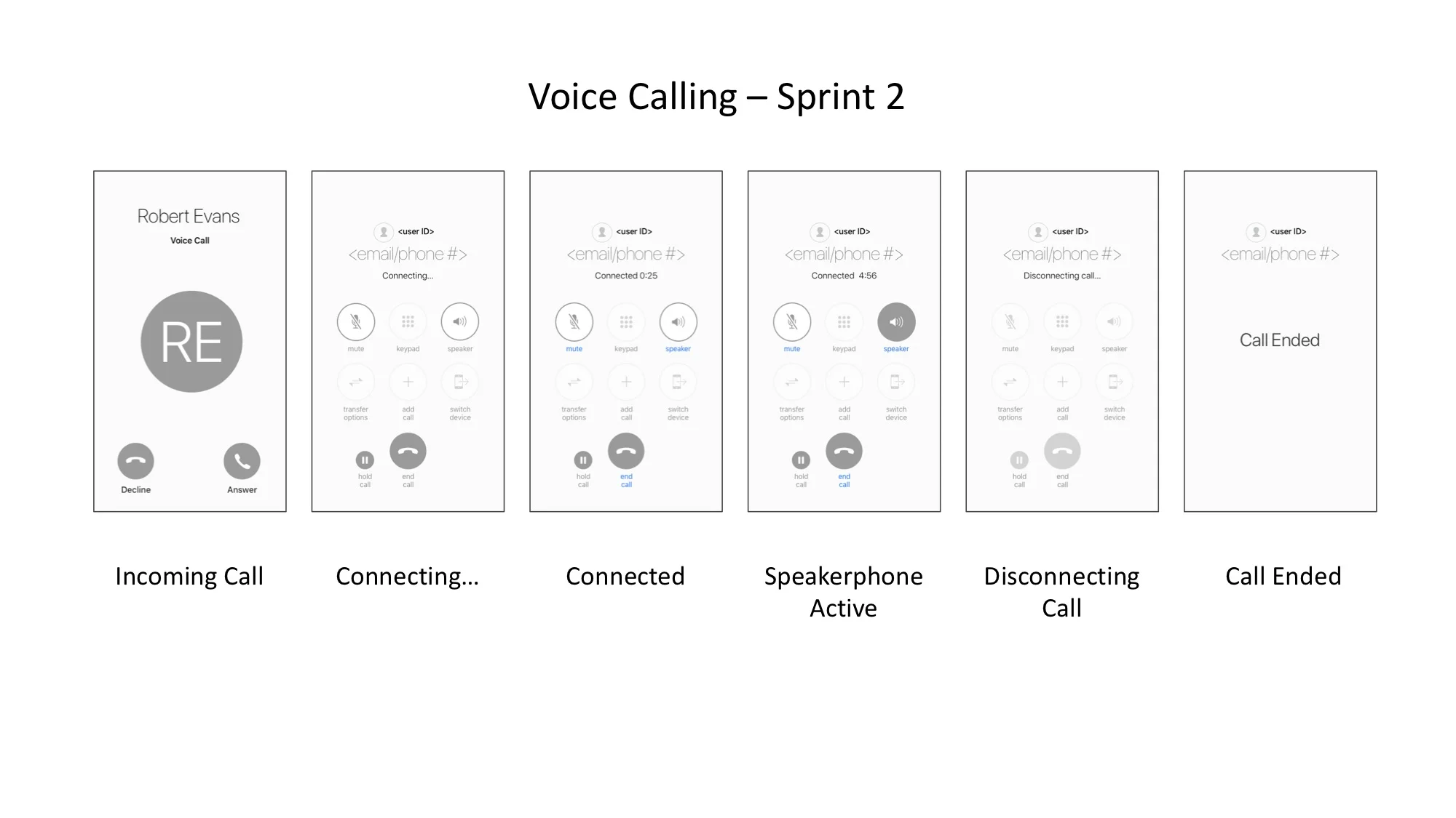
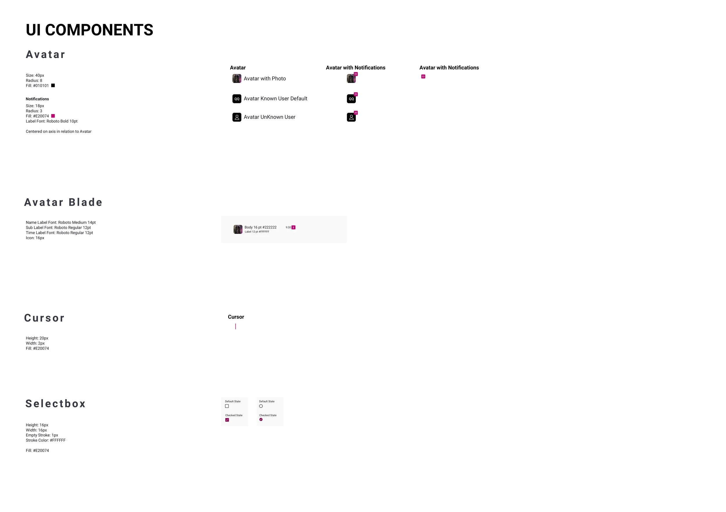
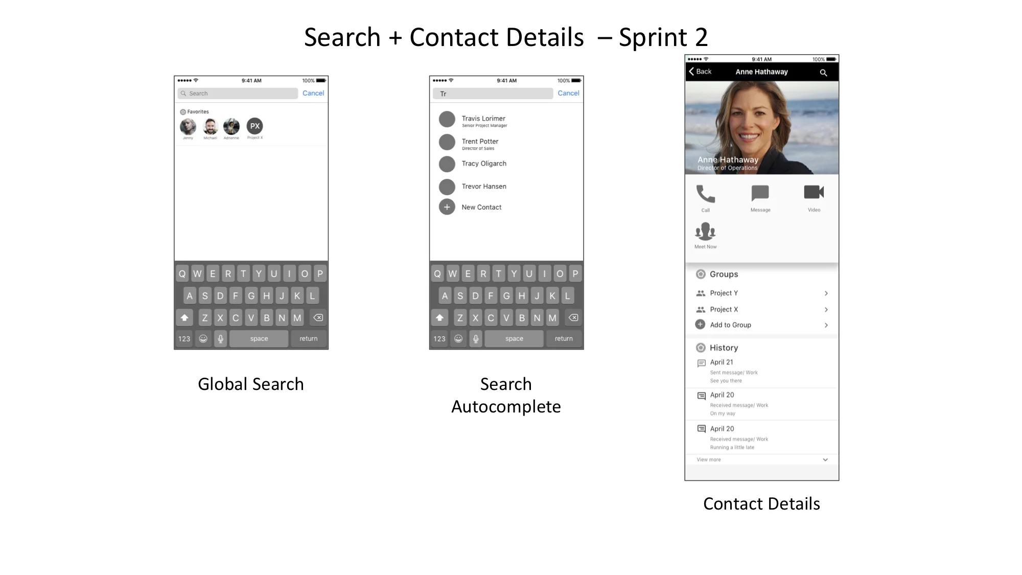
The current application that was on the market was requested to have a UI refresh, with a new potential market share and a new soft brand to be attached. I worked with the product and marketing team to create a plan moving forward with design, we agreed on two in person user research studies and in depth competitive/ comparative analysis of what is currently on the market in that space. The team began to design wireframes per features, as laid out in our sprint planning. Below is an example of a potential user flow used in this project. As well as the beginning of the soft brand visual design language.
Kick-off
Before we could begin work, buy off was necessary from the leadership team. Initial sketches and rough ideas were put together to help illustrate some of the more complex ideas had by the product owners. This included rapid prototyping, rapid design iterations, and constant presentations.
Design language
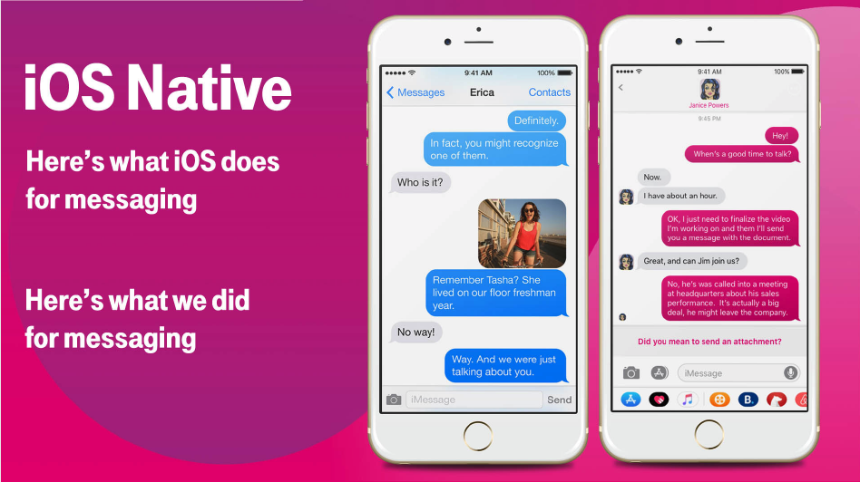
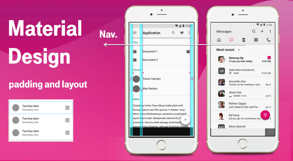
The last piece of the puzzle was creating a design language that fit on brand, inside of each platform's GUI guidelines, and was WCAG accessible.
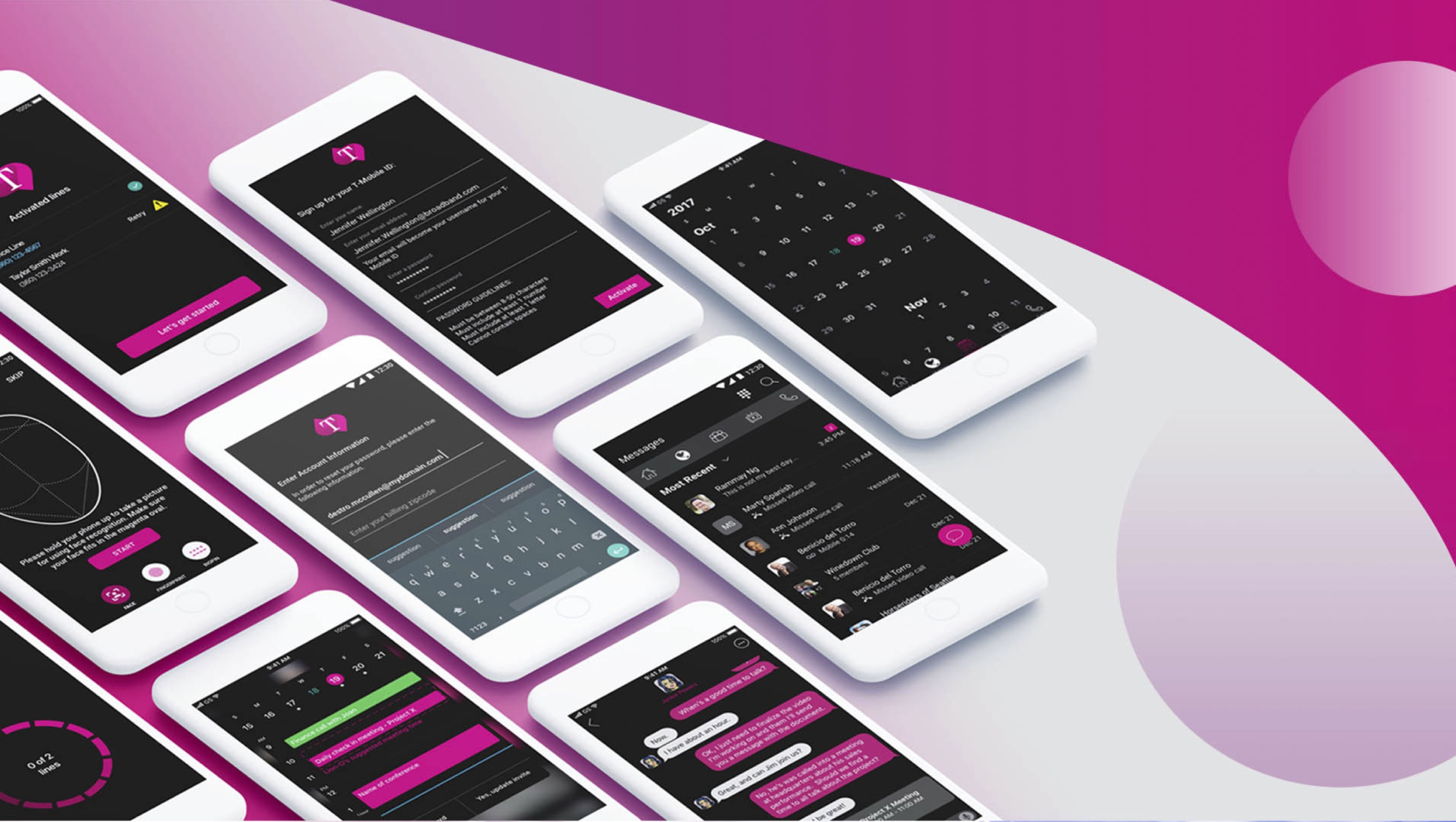
The final results you can see below. There was a dark theme for night time and a light theme for day time. Also keeping in mind the heavy use of this app for its users, the dark background is softer on the eyes and reduced strain.